Essay: The Art of Michelangelo — A selection of works

Class: Art History 300
Assignment: Academic Paper
Date: Nov. 25, 2012

Michelangelo di Lodovico Buonarroti Simoni or more commonly known as simply Michelangelo was an Italian Renaissance[1] poet, sculptor, painter and architect who is viewed today as one of the most influential men to have ever lived and one of the greatest artists in the history of the world. From his fresco paintings to his many sculptures, writings and other artwork, his work is more well-known than most other artists throughout history.

Michelangelo’s work can be seen in much of the world, whether it be in its original form or in museums. His work is said, by scholars, to have inspired the work of many members of the arts for centuries to come. The work of Michelangelo is undeniably beautiful and when viewed among other works, can be pretty easily identified as his work. While it shares many of the aspects of other artwork from the period he lived, Michelangelo’s work is unique to him and that is part of what makes it so interesting. Much of Michelangelo’s work was inspired by the Bible, like most of the work of the Italian Renaissance, but his work captures the thoughts and opinions that he held of such ideas and stories in a way that is special and significant to him.  

            His most famous works are probably those that adorn the ceiling and west wall of the Sistine Chapel. According to All-Art.org, the frescoes on the ceiling of the Sistine Chapel (The Vatican) are the best known frescoes of Michelangelo, but he’s most famous for his sculptures. The fact that he was able to perfect several art forms wasn’t uncommon at the time Michelangelo lived. Many artists perfected many types of art, though most probably focused their energy on one or two (All-Art). “The high regard for the Sistine ceiling is partly a reflection of the greater attention paid to painting in the 20th century and partly, too, of the fact that it, unlike many of the artist’s works in the other media, was completed,” (All-Art, Page 1).

            The ceiling of the Sistine Chapel has always been an intriguing work of Michelangelo’s because of its sheer size and the overwhelming feeling it must give a viewer upon seeing it for the first time. Much of the Sistine Chapel’s artwork is made up of fresco paintings, which is, “a painting using fresh, moist plaster with pigments dissolved in water,” (Farlex) by Michelangelo and other artists of the period. These various fresco paintings depict scenes from the Bible and show the many people who appear throughout it as well as the depiction of many angels. “[The Sistine Chapel is a] papal chapel in the Vatican Palace that was erected in 1473–81 by the architect Giovanni dei Dolci for Pope Sixtus IV (hence its name). It is famous for its Renaissance frescoes by Michelangelo,” (All-Art, Page 8).

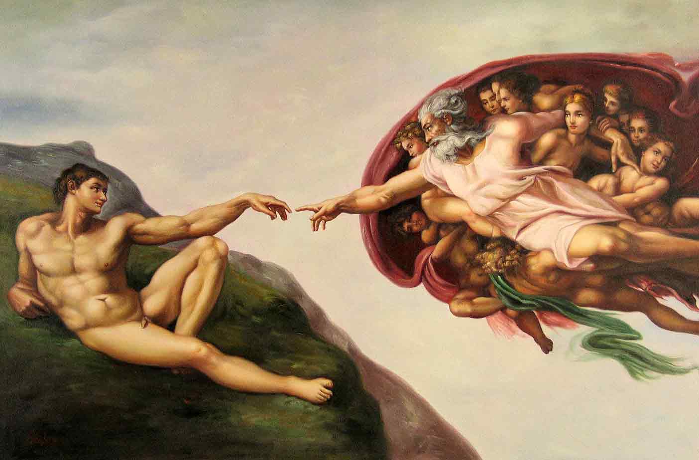
One of the many frescos, which were painted from 1508 – 1512 with others completed between 1535 – 1541, (All-Art, Page 1) on the ceiling of the chapel depicts the creation of man as told by the Bible, and shows God reaching his hand out to Adam as if to say that he is giving the Earth to man. “The Creation of Adam” was completed in 1510 and is 280 by 570 centimeters, (All-Art). God is surrounded by what appears to be angels and there is a clear amount of sky around God, who appears on the right side of the painting, from the viewer’s perspective. Adam is on some sort of green grass-filled mountain top, which clearly depicts that he is on Earth.

            Another painting that is part of the ceiling of the chapel depicts the eating of the forbidden fruit by Eve in the story of Adam and Eve in the Bible. “The Fall and Expulsion from Garden of Eden” is also 280 by 570 centimeters and was completed in 1509-10, (All-Art). On the left side of the painting, Michelangelo shows the before with Adam and Eve sitting by a tree as Eve reaches for the forbidden fruit. There is a tree-trunk in the center of the painting that acts as the dividing line in the before and after idea. Wrapped around the tree is the snake that the devil shows him as in the story in order to lure Eve into eating the fruit. At the top of the tree-trunk, and where the head of the snake would be, is a man that represents the devil. Adam’s arm is extended out and pointing at the devil as if to show him trying to stop Eve from eating the fruit. On the right-hand side of the painting is the devil as he reveals himself, and Adam and Eve walking away in shame. Eve also looks sickly to show that God has given the world disease and famine and other such sicknesses as a result of her eating the fruit. The painting does an extravagant job of telling the entire story of the Garden of Eden from the Bible.

            “Nearby the scene of the creation of Eve shows her with God and Adam, compressed within too small a space for their grandeur. This tension has been interpreted as a token of a movement away from the Renaissance concern with harmony, pointing the way for a younger generation of artists like Pontormo, often labeled Mannerists. Michelangelo’s work on the ceiling was interrupted, perhaps just after these figures were completed. When he painted the second half, he seemed to repeat the same evolution from quiet stability to intricacy and stress. Thus he worked his way from the quietly monumental and harmonious scene of the creation of Adam to the acute, twisted pressures of the prophet Jonah. Yet in this second phase he shows greater inward expressiveness, giving a more meditative restraint to the earlier pure physical mass,” (All-Art, Page 8).

            “The Last Judgment” is another painting in the chapel that was done by Michelangelo. This fresco painting was done at the end of his time working on the massive project and was completed in 1534 for Pope Paul III, (All-Art). The theme of judgment day had been a favorite among artists for many decades. The theme was used mainly for large end walls of churches in Italy during the Middle Ages. After about 1500, artists began to abandon the theme. It is believed that the new found liking of an age-old tradition came from the impulses of a counter-reformation under Paul III. The painting styles featured in the work of the Sistine Chapel is very different from the work that was common for the 25 years leading up to its creation, (All-Art). “The pervasive color harmony is a simple one of brown bodies against dark blue sky. The figures have less energy and their forms are less articulate, the torsos tending to be single fleshy masses without waistlines. At the top centre Christ as judge lifts an arm to save those on his right and drops the other arm to damn those on his left, suggesting in the idiom of the period a scale to weigh men in the balance,” (All-Art, Page 8).

According to the same source, the bottom of the painting depicts the skeletal remains of the dead coming through from their tombs. This is thought to be from inspiration that Michelangelo had gotten from the work of Dante’s Divine Comedy, which is “a great work of medieval literature, a profound Christian vision of man’s temporal and eternal destiny. On its most personal level, it draws on the poet’s own experience of exile from his native city of Florence; on its most comprehensive level, it may be read as an allegory, taking the form of a journey through hell, purgatory, and paradise,” (All History). While these are just a few of the works of Michelangelo that can be seen in the Sistine Chapel, and while there are many others like “Sacrifice of Noah”, “The Erythraean Sibyl”, and the “Ancestors of Christ”,  as well as works from other artists, they are perhaps some of the most prominent and interesting, (All-Art, Page 8). The Chapel is truly an amazing work of art and should be considered one of the great accomplishments in the history of the world.

            Moving on to the sculpture work that Michelangelo created both prior to and following his work on the Sistine Chapel, one of his most famous is the “Battle of Centaurs” created in 1492 at 84.5 CM by 90.5 CM and located in Casa Buonarroti, (All-Art). “Inspired by a classical relief, [‘the projection of figures or forms from a flat background, as in sculpture, or the apparent projection of such shapes in a painting or drawing,’ (Farlex)] created by Bertoldo di Giovanni, the unfinished marble sculpture depicts the mythic battle between the Lapiths[2] and the Centaurs[3]. A popular subject of art in ancient Greece, the story was suggested by Michelangelo by the classical scholar and poet Poliziano,” (Wahoo Art). “Battle of the Centaurs” is a truly beautiful piece of work. It gave a glimpse of Michelangelo’s future in sculpture. This work showed the Michelangelo could work in multiple scales and not just a flat picture. It was also the first time Michelangelo had created a sculpture without using a bow drill[4] and it was the first time he had created a sculpture that used the chisel marks as a final surface. Michelangelo said that it was in his opinion, one of his greatest early works. It also serves as a strong reminder of the fact that Michelangelo definitely was better at creating sculpture are and should have focused even more energy doing so, (Wahoo Art).

The depiction in the work of bodies of the Centaurs and Lapiths basically on top of one another shows the struggle for power that takes place in any battle, whether it is metaphorically or literal. The work is particularly intriguing because as the style goes, it appears to be a flat surface like a painting, but with the three dimensional feel because the figures pop out of the background. This is heavily important in a work that is depicting this power struggle because it further shows the sheer number of bodies in the work. If it were simply a painting, the power struggle wouldn’t be as prevalent because everything would be two dimensional and it wouldn’t have the feeling of a battle to survive as it does without that three-dimensional depiction of how many bodies are involved. The fact that it was created the way it was created definitely adds to the message it is trying to portray, as with most art, the medium and technique are often times just as important as what is being portrayed because they usually help the viewer understand what is going on in the image.

            One painting by Michelangelo that is particularly interesting is “The Holy Family with the Infant St. John the Baptist”, which was created in 1506 using tempera on panel. Its diameter is 120 CM and it is located in the galleria Uffizi in Florence, Italy, (All-Art). “[Tempera is a] painting [style] executed with pigment[5] ground in a water-miscible medium. The word tempera originally came from the verb temper—(“to bring to a desired consistency”). Dry pigments are made usable by “tempering” them with a binding and adhesive vehicle. Such painting was distinguished from fresco painting, the colors for which contained no binder. Eventually, after the rise of oil painting, the word gained its present meaning,” (Britannica).

            “This painting is known as the Doni Tondo. Agnolo Doni was a rich cloth merchant in Florence, and a tondo is a round painting. [Michelangelo] probably commissioned this painting at the occasion of the birth of his first daughter. It is the only panel that with certainty can be attributed to Michelangelo. The tondo has a magnificent wooden frame, probably carved by members of the Tasso family. The five heads depict Jesus, two prophets and two sybils,” (Art Bible).

According to the same source, the piece of work depicts the changing from the Pagan times to that of Christianity. Mary is shown in the picture holding the baby Jesus as she takes him from the arms of Joseph. John the Baptist is in the painting in the background in the water used for baptism (at the right side of the image) and this is the symbol of the changing of the views from Paganism to Christianity, (Art Bible). Perhaps the most interesting element of this painting is the brightness in the garbs of both Jesus and Mary but the darkness in the color of Joseph as well as the low lighting in the background on the naked Pagan children and John the Baptist. The pink in the top that Mary is wearing could depict her femininity while the blue on her lower half may depict her warm, caring nature as a mother.

The yellow of the garbs of Jesus, which are actually the garbs of Joseph but are wrapped around Jesus, though they appear darker on Joseph than on Jesus, could be portraying that of royalty or power as he was seen in the Bible as the king being that he is said to be the son of God. The yellow could also stand for hope. The lesser vibrant colors on Joseph and the figures in the background could be to symbolize that they aren’t as important to the viewer or to keep Mary and Jesus more prominent. It seems as if Michelangelo also depicted baby Jesus atop Mary and Joseph’s arms to show his power and reign over the rest of mankind.

Though Michelangelo’s paintings are world-famous, he is probably best known for his sculptures. The sculpture entitled “David” is another of Michelangelo’s most famous works of art. The “David” sculpture, created circa 1504, (All Art), depicts David of the Bible after his victory over the giant, Goliath. It is made out of marble and stands at an amazing 14 feet tall or about 426 CM, (All-Art). “The Board of Works for the Cathedral of Florence commissioned Michelangelo to sculpt ‘David’ from an enormous block of marble that they had left over from another project. It was commissioned with the idea that it would stand in a niche on one of the cathedral’s buttresses, way up high. Of course, when Michelangelo was finished, they realized that it was far too beautiful to be placed up high, and so it was decided to build a base for the sculpture and to place it right in front of the main government building of Florence (like putting it outside the capital building in Washington D.C.),” (History). Today, the statue stands tall and proud among other sculptures of Michelangelo in the Galleria dell’Accademia in Florence, Italy, (History).

According to a video from Khan Academy’s (“A not-for-profit with the goal of changing education for the better by providing a free world-class education for anyone anywhere,” (Academy)) partner site, smarthistory.org, the statue is a symbol of the republic of Florence because the story of David represented their views of a political freedom. The video’s commentators also pointed out the vast knowledge of the human body that Michelangelo would have needed to possess in order to create the sculpture. They talk about how he correctly depicted the lean on the right leg and the way the muscles and veins react to such a stance. They point out the muscles in his right hand and the slight bend, which shows that David is in the act of gripping the stone he uses to defeat Goliath. In his left hand, the video points out, David is holding the slingshot for which the rock is used. Lastly, David is looking off to his left with a confident and focused look as if he is gearing up in order to fight Goliath. David is depicted nude because the Bible story says David fought Goliath with no armor, however, it doesn’t say he’s nude, but it is obvious this is how Michelangelo interpreted the Bible’s use of the idea of no armor, (History).

A sculpture of Michelangelo that is also very famous is that of “Moses”. “Moses” was created circa 1513 – 1515 out of marble and stands at 215 CM. It is located in S. Pierto in Vincoli, Rome, (All-Art). “[The sculpture,] ‘Moses’ by Michelangelo…was to be part of the tomb of Pope Julius II. The posture is that of a prophet, posed on a marble chair, between two decorated marble columns. His long beard descends to his lap and is set aside by his right hand, which also leans on the plates. This posture of the seated prophet also appears in Michelangelo’s Sistine Chapel frescoes from a year earlier. In fact, here we have a rare example of Michelangelo as the painter of the Sistine Chapel influencing Michelangelo, the sculptor. Moses found his people worshipping the Golden Calf – the false idol they had made. His anger, profoundly [sculpted] by Michelangelo, defies the prison of stone, the limits of the sculptor’s art,” (Rome.info).

The sculpture was supposed to be part of a massive project as a tomb for Pope Julius II but the tomb was never finished because of what is believed to have been financial restraints. “Michelangelo once wrote, ‘that a true and pure work of sculpture, by definition, one that is cut, not cast or modeled should retain so much of the original form of the stone block and should so avoid projections and separation of parts that it would roll downhill of its own weight.’ These words reflect Michelangelo’s love of quarried marble and his reverence for the very stone that lies at the heart of his chosen art form of sculpture. In the ‘Moses’ sculpture, a respect and total understanding of his materials and his own abilities combine to create the masterpiece hewn from marble by a 38 year old, at the height of his genius,” (Rome.info).

This work of art, though not as large or prominent as “David”, is certainly a masterpiece and a wonderful representation of the grandiose abilities and works of Michelangelo. The detail in the face, the beard and the robe in the lap of the figure show the abilities of a true artist. “The ‘Moses’ [sculpture] encapsulates Michelangelo’s own courage and passion at a time when he was fighting to be able to complete the tomb of Pope Julius II. The continual battles waged with ‘lesser’ mortals was a constant companion in the life of Michelangelo. Fighting to create the work he envisaged, in the manner and style he felt was given to him by God. It is true he never completed the Pope’s tomb, but in ‘Moses’, we can see once again his restless genius at play. He considered it his most important work,” (Rome.info).

For many, “Moses” is another one of the literally larger than life reminders of a time when art took precedent over so many other things in society. It should also remind us of the importance of literature and its inspiration to not only the arts but the morals, beliefs and ideals of humankind. This sculpture depicts one’s interpretation of such literature, but represents what can be learned and known about a culture by the words and the art it produces. It not only represents what, in literature, can be used for good, but with Michelangelo’s feeling that he was above the people he was being paid by because of a power given to him by his God, the “Moses” statue and the anger in its body and face show how literature’s misinterpretations can cause hate.

The final two pieces of work that must be examined in understanding the grand scope of Michelangelo’s tremendous career as an artist and his impressions he left on the world throughout his 89 years on the planet are “Pieta” and “Pieta Rondanini”. “Pieta”, which is a word that means representation of the dead Christ, attended by the Virgin Mary or by holy women and angels, (Farlex), was created circa 1499 out of marble and is 174 CM high and 195 CM at its base, (All-Art). Today it resides in Basilica di San Pietro at the Vatican, (All-Art). “A statue was commissioned for the tomb in St. Peters of the French cardinal Jean de Billheres, who was a representative in Rome. According to the formal agreement, the Pieta` was to be ‘the most beautiful work of marble in Rome, one that no living artist could better.’ Michelangelo was neither daunted nor intimated by such a request and upon its completion the world declared that Michelangelo’s Pieta ‘surpassed not only the sculptures of his contemporaries but even those of the ancient Greeks and Romans themselves; the standards by which all art was judged,’” (Rome.info).

The lamentation of Christ was popular among artists in Northern Europe beginning in the fourteenth century. This type of art traditionally focused on the pain of Mary and Jesus. However, the sculpture by Michelangelo shows Mary holding the dead Christ, which is a great dedication to the ideals held about Biblical times by the Renaissance Humanist movement. Michelangelo used the ideas of beauty and physical intrigue to show a moment in time to show the power of Mary. This statue shows her ability to be strong through a very difficult time and keep her beauty and power regardless of the situation, (Rome.info). “Michelangelo worked the piece in the round, using a drill for speed and achieving a highly polished sheen that made it fairly impossible to believe the sumptuously sculpted figures began as a block of cold stone. Michelangelo’s mastery of composition is evident in the unique triangular shape that conveys a stunning grandeur, and a profound knowledge of human anatomy served him well in his creation,” (Rome.info).

According to the same source, the depiction of Mary holding her hand out in the sculpture represents her reaching out to the viewer, and to the people of her time, and asking them to share in the feeling of pain she feels for the death of her son. At the same time it shows her strength and that she is proud of her son. This again shows the intrigue and inspiration by the events of the Bible that had been so prevalent for Michelangelo.

The “Pieta Rondanini” was created circa 1552 – 1564 and is an unfinished marble sculpture that stands at 195 CM. It is located in Castello Sforzesco, Milan, (All-Art). The statue looks very similar to Michelangelo’s previous Pieta work, but this one depicts Mary standing up and holding Jesus in her arms in a standing position over her right arm. This sculpture, though unfinished is much less detailed than “Pieta” and it isn’t nearly as interesting to look at. “The ‘Pietà Rondanini’ is considered to be the final sculptural masterpiece by Michelangelo. In this work, the theme of compassion, which had been approached various times by the artist, is particularly moving; the sculptor had worked on it for many years without completion. The sculpture, as we see it today, is the final elaboration of an idea initiated, presumably, in 1552. Some of the features from the first work can still be easily identified: the smooth legs of Christ, his right arm broken off from the body and the face of the Virgin facing a different way, [recognizable] from an outline of the eye and nose on the left side of the head. Around 1555 the maestro reworked this project significantly modifying the composition: the figures assumed the actual lengthened shape in which Christ and the Virgin seem to mould into one in a pitiful embrace. The marble assemblage is placed on a Roman altar; the same upon which the sculpture was found when it was in the Rondanini Family collection,” (Milano City).

Michelangelo lived from March 6, 1475 to February 18, 1564, (All-Art). He painted many paintings, crafted many sculptures, created poems and drawings and even architectural structures. His work is remembered and seen as some of the best artwork ever created because of the passion and inspiration that is evident in every piece of work he completed—and didn’t complete. He is among the likes of Leonardo Da Vinci, Van Gogh, Pablo Picasso and Rembrandt in terms of his abilities and legacy. His work is all around us and even in places like America, a nation that didn’t form until centuries after his death; the inspiration of his work is seen daily. Michelangelo’s works cannot be summarized fully in an essay. They cannot be condensed into any number of words, for Michelangelo’s works must be experienced. They must be seen to be truly appreciated. It should be the goal of any and every person alive to glance upon just one work of a legend such as him, an understatement for sure. Though Michelangelo lived during a time when hand-crafted art was a much more common practice than it is today, he was a standout artist and one who took charge of his craft. Michelangelo should truly be remembered for what he was, above all else, a genius.   

Works Cited (Bibliography)

All biographical information and artwork creation dates, sizes, materials and current day locations are from www.all-art.org. The information contained on this website came from Encyclopedia Britannica, according to a citation at the top of each All-Art page.

Academy, Khan. “Khan Academy – About.” Khan Academy . Khan Academy. Web. 21 Oct 2012. <http://www.khanacademy.org/about&gt;.

All-Art, Page 1. “Michelangelo, Page 1.” History of Art – Early Renaissance. All Art. Web. 21 Oct 2012. <http://www.all-art.org/early_renaissance/michelangelo1.html&gt;.

All-Art, Page 8. “Michelangelo, Page 8.” History of Art – Early Renaissance. All Art. Web. 21 Oct 2012. <http://www.all-art.org/early_renaissance/michelangelo8.html&gt;.

All History, . “Dante “The Divine Comedy”.” All History. AllHistory.org. Web. 21 Oct 2012. <http://all-history.org/186-b1.html&gt;.

Art Bible, . “Michelangelo Buonarroti 1475 – 1564.” Art and the Bible. Art and Bible Information – artbible.info, n.d. Web. 21 Oct 2012. <http://www.artbible.info/art/large/508.html&gt;.

Britannica, Encyclopedia. “Definition of Tempera Painting .” Encyclopedia Britannica – Facts Matter. Encyclopedia Britannica . Web. 21 Oct 2012. <http://www.britannica.com/EBchecked/topic/586515/tempera-painting&gt;.

Farlex, The Free Dictionary. “Definition of fresco.” The Free Dictionary by Farlex. Farlex, n.d. Web. 21 Oct 2012. <http://www.thefreedictionary.com/fresco&gt;.

Farlex, The Free Dictionary. “Definition of pieta.” The Free Dictionary by Farlex. Farlex, n.d. Web. 21 Oct 2012. <http://www.thefreedictionary.com/pieta&gt;.

Farlex, The Free Dictionary. “Definition of relief.” The Free Dictionary by Farlex. Farlex, n.d. Web. 21 Oct 2012. <http://www.thefreedictionary.com/relief&gt;.

History, Smart. “Smart History – David.” Smart History. Smart History presented by Khan Academy. Web. 21 Oct 2012. <http://smarthistory.khanacademy.org/Michelangelo-David.html >.

Milano City, . “Pietà Rondanini .” Milan is Tourism . Milano City, n.d. Web. 21 Oct 2012. <http://www.tourism.milan.it/wps/portal/!ut/p/c0/04_SB8K8xLLM9MSSzPy8xBz9CP0os3hzS0O_QGcLEwP_ICNTA08D_2APT1dHYwMDE_3g1Dz9gmxHRQCvgnB_/?WCM_PORTLET=PC_7_791NQC840OR250I0OSHIEA3007_WCM&WCM_GLOBAL_CONTEXT=/wps/wcm/connect/en/situr/home/artecultura/capolavori/opere/opera280 >.

Rome.info, . “Michelangelo’s Moses.” Rome.info – Michelangelo’s Moses. Rome.info, 21 2012. Web. 21 Oct 2012. <http://www.rome.info/michelangelo/moses/&gt;.

Rome.info, . “Michelangelo’s Pieta.” Rome.info – Michelangelo’s Pieta. Rome.info, 21 2012. Web. 21 Oct 2012. <http://www.rome.info/michelangelo/pieta/&gt;.

Wahoo Art, . “The Battle of the Centaurs.” Michelangelo Buonarroti . Wahoo Art. Web. 21 Oct 2012. <http://en.wahooart.com/A55A04/w.nsf/Opra/BRUE-5ZKD7M&gt;.

Works Cited (Footnotes):

Farlex, The Free Dictionary. “Definition of Bow Drill.” The Free Dictionary by Farlex. Farlex, n.d. Web. 21 Oct 2012. <http://www.thefreedictionary.com/bowdrill&gt;.

Farlex, The Free Dictionary. “Definition of Centaurs.” The Free Dictionary by Farlex. Farlex, n.d. Web. 21 Oct 2012. <http://www.thefreedictionary.com/centaurs&gt;.

Farlex, The Free Dictionary. “Definition of Lapith.” The Free Dictionary by Farlex. Farlex, n.d. Web. 21 Oct 2012. <http://www.thefreedictionary.com/lapith&gt;.

Farlex, The Free Dictionary. “Definition of pigment.” The Free Dictionary by Farlex. Farlex, n.d. Web. 21 Oct 2012. <http://www.thefreedictionary.com/pigment&gt;.

History.com, . “Italian Renaissance.” History.com . The History Channel Network, n.d. Web. 21 Oct 2012. <http://www.history.com/topics/italian-renaissance&gt;.

Images (In order of appearance in the essay):

“The Creation of Adam” by Michelangelo

http://www.prlog.org/11178287-the-creation-of-adam.jpg

“The Fall and Expulsion from Garden of Eden” by Michelangelo

http://www.wga.hu/art/m/michelan/3sistina/1genesis/4sin/04_3ce4.jpg

“The Last Judgment” by Michelangelo

http://www.romecityapartments.com/blog/wp-content/uploads/2012/05/Michelangelo_-_Fresco_of_the_Last_Judgement.jpg

“Battle of Centaurs” by Michelangelo

http://en.wahooart.com/A55A04/w.nsf/Opra/BRUE-5ZKD7M

“The Holy Family with infant St. John the Baptist” by Michelangelo

http://www.gfmer.ch/Art_for_Health/Images/Italian_Renaissance/Michelangelo_Holy_Family.jpg

“David” by Michelangelo

http://static.ddmcdn.com/gif/michelangelo-1.jpg

“Moses” by Michelangelo

http://static.ddmcdn.com/gif/michelangelo-sculptures-16.jpg

“Pieta” by Michelangelo

http://www.romaviva.com/vaticano-castel-santangelo/michelangelo-pieta.jpg

“Pieta Rondanini” by Michelangelo

http://static.ddmcdn.com/gif/michelangelo-sculptures-45.jpg


[1] Toward the end of the 14th century AD, a handful of Italian thinkers declared that they were living in a new age. The barbarous, unenlightened “Middle Ages” were over, they said; the new age would be a “rinascità” (“rebirth”) of learning and literature, art and culture, (History.com).

[2] One of a Thessalian tribe who at the disastrous wedding of their king defeated the drunken Centaurs, (Farlex).

[3] One of a race of monsters having the head, arms, and trunk of a man and the body and legs of a horse, (Farlex).

[4] A drill worked by a bow and string, (Farlex).

[5] Dry coloring matter, usually an insoluble powder, to be mixed with water, oil, or another base to produce paint and similar products, (Farlex).

Posted in College Work, Sacramento City College | Tagged , , , , | Leave a comment

12th Avenue entrance closed Nov. 15

Road work will divert traffic for four hours

Originally published Nov. 15, 2012 by SacCityExpress.com

The 12th Avenue entrance of Sacramento City College will be temporarily closed during construction. Photo by Evan E. Duran.

The side entrance to City College at 12th Avenue and Panther Parkway will be closed between 10 a.m. and 2 p.m. on Nov. 15 by the city of Sacramento in an effort to complete improvements to this section of the road as part of a footbridge project.

“It’s going to be a little inconvenient for three to four hours,” said City College Director of Operations Greg Hayman. “It’s not the main entrance so students can still go through the west parking lot to get to the parking garage.”

According to Hayman, traffic will be diverted to the west parking lot where drivers can turn left on Panther Parkway to access additional parking. Traffic will also be reduced to one inbound lane, which will be diverted directly into the parking structure.

Drivers leaving the parking structure and the North Lot during the closure will need to exit via 24th Street.

“The city is trying to get this work done before the rain comes on Friday,” said Hayman. “This may be the last dry spell we see before the weather changes so we’re trying to accommodate [the city] the best we can. We regret the inconvenience this may cause and appreciate your patience.”

The footbridge, which will create a path over the light rail tracks next year, will be a part of the Curtis Park Village project slated to begin in 2013. This closure is part of the final phase of improvements to the campus roadways that will help direct foot traffic from Curtis Park Village out to the street.

Further information is available by contacting Greg Hayman at (916) 558-2544.

Posted in News, Sac City Express (SCC) | Tagged , , , , , , , , , , , , , | Leave a comment

Proposition 30 passes, 32 fails

Calif. proposition results

Originally published Nov. 9, 2012 by SacCityExpress.com

Students on City College campus held Prop 30 posters much like this one shown here to help get the proposition past this November election. Photo by Evan E. Duran.

Arguably the most important, and certainly controversial for City College students, ballot measure on California’s ballot, Proposition 30, passed by a narrow margin early Wednesday morning with a final percentage of 53.9 percent.

Proposition 30 hovered around 50 percent support for most of Tuesday night, but slowly climbed to victory, according to the Associated Press.

“Look, this was a tough fight,” said Gov. Jerry Brown of the ballot he backed. “People said I was crazy to go to the people.”

Additionally, Proposition 32, which would have seen political contributions by payroll deductions, failed with a 56.1 percent vote. This bill was up against Proposition 30.

Brown’s tax measure will initiate a one-quarter cent increase in California sales tax, as well as a seven-year income tax increase for California earners who make over $250,000 a year. The money will be distributed to education and public safety funds, according to the Associated Press.

The passing of Proposition 30 also stopped several major planned budget cuts for all of California’s colleges, including major cuts to City College.

“People believe in our schools,” said Brown. “A belief in the capacity of the state government to make some wise investments that will benefit all of us. That was what Prop. 30 was all about.”

Other propositions that passed included Proposition 35 in support of stricter human trafficking laws and Proposition 36, which calls for weakening of the harshness of California’s three strikes law.

Among those that failed to pass were Proposition 34, a bill that aimed to repeal the death penalty in California; Proposition 33, which would have based auto insurance rates on driver history; and Proposition 38, which would have seen an increase in taxes to support early childhood education, according to the Sacramento Bee.

More information on the election results is available via the Sacramento Bee.

Written in collaboration with Jessica Rine. 

Posted in News, Sac City Express (SCC) | Tagged , , , , , , , , | Leave a comment

City College to host post-election forum

Professors to discuss results, answer questions

Originally published Nov. 8, 2012 by SacCityExpress.com

Dominic Cerri, a history professor at City College, will be one of the panelists speaking on post-election forum in the Student Center on Nov. 8, 2012. Photo by Tony Wallin.

City College’s History, Political Science and Social Science departments will host a post-election forum in the Student Center on Nov. 8, which will discuss the results of the 2012 election.

Students who attend are being encouraged to come with plenty of questions, as a panel of City College professors will be answering everything students want to know about the results of this year’s election and what they mean for students and for California. Students will also have a chance to share their thoughts on the results of the election.

The moderator of the forum will be Paul Frank, Political Science professor. Panelists will include political science professor Dagne Tedla, sociology and women’s studies professor Susan Mannon, and history professors Stuart Graybill and Dominic Cerri.

The event will take place at noon and all students are welcome.

More information on the event is available by contacting the Paul Frank of the Political Science Department at (916) 558-2261.

Posted in News, Sac City Express (SCC) | Tagged , , , , , , , , | Leave a comment

Tipping is not a requirement, it’s a choice

Food service employees need to get over themselves

Originally published Nov. 6, 2012 by SacCityExpress.com

A receipt on a restaruant table.

A receipt with a line provided for the addition of a tip. Photo by Evan E. Duran.

It was 5 a.m. and I couldn’t sleep.

The wife wasn’t sleeping well either, and we both felt like we could eat a cow. We decided that an early morning breakfast at IHOP would have to suffice.

As we arrived inside the restaurant, we quickly noticed there was no one at the front.

We waited, and shortly thereafter were seated by a bubbly young woman who politely explained to us that she was the manager and that her server hadn’t shown up that Friday morning.

She was all by herself, but provided excellent service. She brought us our food promptly, kept our drink cups filled and even asked what we had planned for the day, all while helping two or three other couples, and stopping every once in a while to leave a message on her absent server’s voice mail.

When we left, we gave her a tip because she did a wonderful job providing us with extraordinary service, despite being alone. In this type of case, giving a tip is a no-brainer.

But what about the everyday run-of-the-mill service that a food service employee is supposed to provide as a requirement of their job? Is a tip always necessary in these cases? For me, the answer is no.

It seems to me that in the United States, society feels that giving tips to food service employees should be a requirement or is, in most cases, the right thing to do. Of course, if servers go out of their way to help their customer, it’s a nice gesture to give a tip.

What bothers me are the waiters and waitresses that feel entitled to them regardless of the job they do. There are even some restaurants that automatically calculate the tip and add it to the bill when the price reaches a certain point. If I were to ever find myself at one of these establishments, I would laugh in the server’s face and refuse to pay the tip.

People seem to not realize that giving a tip is the choice of the patron. A recent picture posted on www.reddit.com showed a receipt from an unnamed restaurant where a woman’s bill was approximately $140. The woman decided not to leave a tip, and instead wrote down a lame excuse that she’s a single mother and can’t afford to tip. She also wrote that the service was great.

Now, I’m not arguing that she was in the right in terms of her silly excuse or the fact that if a single mom can afford to spend $140 on one single meal, she should be able to afford a tip of a couple dollars. However, I do feel it was her right and more importantly, her choice whether or not to leave a tip. I would advise her next time just to thank the servers for their service verbally and not write down a worthless excuse.

This isn’t what got me fired up though. What prompted me to share my feelings was that the receipt was posted online by an angry employee who felt the woman should have given him or her a tip. It’s this kind of entitlement that bugs me.

Upon speaking with some friends and family online, I was annoyed to see that most people agreed with the server. I understand the bill was higher than a typical bill at a restaurant tends to be, and I also understand that food service employees are paid less than minimum wage in most cases and that these employees tend to rely on their tips to pay their bills, but that isn’t my problem.

If you don’t make enough money as a food server, here’s a tip: get a different job. I work in retail and go out of my way to help customers all the time, but my employer has a strict rule that we are not allowed to accept any kind of tips. Why should it be any different?

When I go to a sit-down food establishment, I expect to be greeted at the door, seated, my order taken, my food brought to me promptly and my drink cup kept full. I shouldn’t be expected to pay extra for this service.

Not to mention that places like IHOP charge around $10 for an egg, hash browns, two slices of bacon and a piece of toast. They charge extra for a drink. Judging by the quality of the food and the amount served, the price of the basic service is included in the price of the meal.

Then there’s the fact that many of these restaurants have basically become only slightly better than fast food joints. Take Denny’s for example. My wife and I can eat a meal there for about $23. We pay around $16 at a place like Taco Bell or Burger King. The extra cost, to me, pays for the service.

I still get my order taken, am given a place to sit down, and my food is still cooked for me at the fast food place, so really I’m paying an extra $7 to have my food brought to me and my cup refilled, a service that some fast food places even offer. If I eat at Home Town Buffet, I pay even more and I have to go and get my own food.

In the end, it’s not that I can’t afford a $2 to $3 tip; it’s the principle of the whole thing. Giving a tip should only be prompted for exceptional service. I’m also not one to do something just because society says I should.

If a waiter or waitress does not go outside the realm of what I call normal service, I don’t tip.

Posted in Opinion, Sac City Express (SCC) | Tagged , , , , , , , , , , , , , , | Leave a comment

Calif. Gov. Jerry Brown pumps up City College students

Rally pushed the importance of Prop. 30, voting

Originally published in the Oct. 16, 2012 print edition of the Sac City Express 

California State Senate President pro Tem, Darrell Steinberg speaks in the courtyard to City College students and faculty on Prop 30 while supporters Governor Jerry Brown on the left holds up a banner and Chancellor Brice Harris (right) gives applause. Photo by Kate Paloy.

California Gov. Jerry Brown visited City College Oct. 18 to address Proposition 30 and rally students to vote in the Nov. 6 election.

Brown spoke on the importance of stopping statewide budget cuts on education. Darrell Steinberg, California Senate president Pro Tem; Taylor Valmores, City College Student Senate president; Brice Harris, incoming chancellor of California Community Colleges and former chancellor of the Los Rios Community Colleges District; and Jeff Freitas, secretary-treasurer of the California Federation of Teachers, joined the press conference in urging City College students to vote for Proposition 30.

“The state has been cutting community college courses,” said Brown. “That’s bad. Education has to be No. 1, but when the whole pot of money gets smaller then everything gets cut. The idea of Proposition 30 is to put some more money into the state coffers so we can pay for schools, and colleges and University of California. This is a crucial opportunity.”

The event took place on Thursday in the Art Court Theatre Courtyard with an approximate turnout of 500 students, faculty, staff and community members, according to City College campus police. Those in attendance included students from other Los Rios campuses, like American River College and local media like KCRA.

Steinberg kicked off the rally by getting students excited to vote.

“You know in Ohio today, you got President Obama standing with Bruce Springsteen,” said Steinberg. “That rally has nothing on this rally here today. It is so great to see so many young people out here today. Your vote matters and you’re going to make a difference in our great state.”

City College’s Valmores was introduced during the rally by Steinberg and spoke confidently on the importance of voting. He said he was shocked during recent Student Associated Council voter registration drives to find out how many students told him they wouldn’t go out and vote.

“In my time here [at City College] I have seen first-hand how important community college is,” said Valmores. “It is much harder to be a student these days. We need to rally behind a revenue solution that helps prevent more cuts and supports education; Proposition 30 is that solution.”

Students attended the event for many reasons including a chance to get extra credit, to see the governor, and to find out more information on making a choice on Proposition 30.

Cosmetology major, Anduli Smith said she was interested in hearing “[Brown’s] yes on 30 promises to fulfill.”

Other students weren’t in favor of the proposition.

“Even though community colleges get money, sales taxes go up,” said Kathleen Reiley in response to the negative side of Proposition 30 passing.

In regards to opposition of Proposition 30, which says that the revenue generated by the tax hikes included in Proposition 30 is not guaranteed to be used for education, Steinberg said that isn’t the case.

“Education is not only mandatory in the budget; it’s of the highest priority,” said Steinberg in an exclusive interview with the Express. “It’s the majority of what we invest. The opposition is a bit of a ridiculous argument. We have an obligation to stop cuts in education.”

Brown agreed on the topic of the opposition.

“[The money is] going to community colleges, don’t believe these other guys,” Brown told the Express. “Proposition 30 is not about me, it’s about us. It’s about our future.”

According to analysts, community colleges will lose $6 billion statewide if Proposition 30 fails. Steinberg emphasized the impact of Proposition 30 on City College.

“It’s really important that we’re here at Sacramento City College,” said Steinberg. “Our community colleges in California are the gateway for opportunity. It’s the place where we train the majority of our nurses and firefighters. We have made enough cuts to the community colleges.”

For more on the event and Proposition 30, see the upcoming print edition of the Express, which will be on newsstands around the City College campus on Oct. 23 and online Oct. 25.

More information on Proposition 30 is available here.

Additional reporting by Wendy Aguilar.

Posted in News, Sac City Express (SCC) | Tagged , , , , , , , , , , , , , , | Leave a comment

Gov. Jerry Brown to visit SCC 10-18

Speech will address Proposition 30

Originally published Oct. 16, 2012 by SacCityExpress.com

Courtesy of Office Of Governor Edmund Brown.

City College’s Art Court Theatre Courtyard will host Calif. Gov. Jerry Brown on Thursday, Oct. 18, at noon for a speech about Proposition 30 and what it means for students.

Proposition 30 is a measure that will appear on the ballots in the Nov. 6 election, which according to California’s official voter guide website will increase taxes on earnings over $250,000 for seven years and sales taxes by one-fourth of a cent for four years to fund schools.

If the measure passes it would generate approximately $6 billion a year over the next few years for schools and public safety. If the measure is not passed, severe cuts in education for 2012-2013 would take effect.

Opposition of the measure claims that the measure would mean $50 billion in tax increases but no guarantee the money will go to schools.

According to Annette Barfield, City College professor, counselor and president of the Los Rios College Federation of Teachers, a positive turnout for Brown’s speech will show that City College students are actively engaged in their community, represent a large part of local citizenry, and the impact an educated society will have on the future of California.

Barfield and other campus leaders are encouraging students to attend, as well as for professors to offer extra credit opportunities and class time to attend the event.

More information on Proposition 30 is available here.

Posted in News, Sac City Express (SCC) | Tagged , , , , , , , , , , , , , , | Leave a comment

Three works of art featured at the Crocker Art Museum in Sacramento + Museum Visit Report

Class: Art History 300
Assignment:
Museum Visit
Date:
Oct. 14, 2012

Exhibit One:

“Progress II,” 1976, Luis Jimenez, fiberglass, acrylic paint

Crocker Art didn’t list the size of their works but this thing is huge. It depicts a bull being roped in by a cowboy on a horse. Below the two animals is a base with a separate sculpture of a snake and one of an owl, which was holding a dead rodent in his claw. The part of the base that the animals were actually attached to had a skull, and several other animals. It was very intricate and well designed. The two animals were bigger than me and they were probably close to life size. The whole work was overwhelmingly large and the eyes of the animals even lit up, though one of the eyes on the horse was burnt out.

There weren’t a lot of colors used and it seemed to be using mostly a tertiary color palette including brown, but also had elements of warm colors like red. It also used deep purples, which created sort of a glaze over the work with glitter. The piece also used green for the snake and black for the hair of the horse. A video from Sacramento Bee covering the installation of this massive work said that the paint was boat paint, used to give the work a “hot-rod” look. The fact that the whole thing was built out of glass blew me away. It must have taken forever to create.

According to the information card, the piece represents progress in art history. The inspiration was drawn from Western artists such as Frederic Remington and Charles Russell. The first “Progress” work depicted a Native American buffalo hunt. The information card also said that the titles of the two works refer to the march of civilization and industry across the continent.

I chose this work because when I saw it, it was just so amazing. It’s massive size, it’s depiction of a very intense and exciting scene and the symbolism of the work all struck me as amazing. I took several minutes walking around the work and noticing all of the details and the subtle additions to the base. The details of the bull, the details of the horse, to the look on the cowboy’s face, the rope pulling in the bull was even there. It was truly magical too because of the way it is set up, it really appears to be a frozen scene pulled right out of a real event.

Exhibit Two:

Attic (Greek), Lekythos, No Name, Circa 620-480 BCE, Ceramic

This pot was very stunning. It was approximately one foot tall and had a very small opening at the top. The base of the pot was larger so it could hold a good amount. The pot was a orange-brown color and in black, had symbols around the part directly underneath the top of the bottle. On the base of the bottle was the depiction of what appeared to be a man. He was painted in all black and appeared to be wearing some sort of large robe. He was playing a harp instrument and in front of him were two females also in large robe-like attire. Behind the musician were another two women who looked identical to the women in front of him, except they were facing the opposite direction, being that they were behind him.

Unfortunately, Crocker Art didn’t list much information about this piece, but upon doing some further research online, I found that these pots were used for the remains of unmarried men and often depicted everyday events or rituals. This would explain the man playing music for the women and also why the hole is so small. It most likely wasn’t intended to be poured back out.

I chose this piece because simply being in the same room next to this and the many other pieces that were so old, was truly an awesome experience. Many of the pieces in this room were missing part of the structure like one was a small statue of an Egyptian woman and the body was completely missing. This pot in particular stood out to me though because it was truly stunning and the level of detail in the figures on the base was amazing.

Exhibit Three:

Unidentified Asmat Papua, Indonesian province, Late 20th Century, “Spirit Canoe” wood, red, black and white pigments, feathers, fiber, coix seed additions

This canoe sculpture, referred to as a Wuramon, was also very large. It was sitting on a base on the floor, which made it very easy to see the detail of the work and the intricate details that were portrayed. According to the information card this was a smaller Asmat piece, but it was still quite large. I’d estimate it was at least 10 feet. The information card said that the Asmat pieces usually were about 30 feet long, but that this one shared the open hull design as expected of these types of work.

The information card said that the figures on the canoe were a crew of spirit figures on their way to the next world. I guess this explains the open hull, seeing as they wouldn’t be using the boat to float in water. The card also explained that the red striping on the work depicted swiftness in navigation. Each figure is marked by social status with a process called scarification and the adornments of black feathers.

The craziest part about this work to me was that these were said to be used in the ceremony of the deceased and the celebration of boys becoming men, but that they were often only used once and then destroyed. I guess they didn’t see them as art because destroying something this amazing today would be a travesty.

I chose this work because it was very detailed and when I saw it, I was very intrigued by what it was used for and what it was depicting. I was also curious about why the hull was missing since it appeared to be a canoe. Luckily, Crocker provided this information, unlike some of their other items on display.

Visiting the Crocker Art Museum in Sacramento

            The Crocker Art museum has long been a staple in the Sacramento area. For residents of the area, it’s one of those places that have been seen a hundred times—or so it seems. Along with places like the Railroad museum, some Sacramento residents become over-saturated to these attractions. However, in 2010, the Crocker Art Museum underwent a major change. A new branch was added on and opened for business that year and according to the facility’s pamphlet, it tripled the size of the gallery’s offerings. Unfortunately, this came at the cost of the museum cutting back its popular free Sunday morning visits to just once a month, but along with it brought a bigger and more fulfilling experience.

            Upon entering the new building, visitors should notice the beautiful architecture that can be considered a work of art in itself. There are wood floors, which are quite comfortable to walk on, carpeted areas, custom built display cases and high ceilings that allow for a comfortable environment, which is well-lit and that makes it easy for a viewer to get lost in their surroundings as the art becomes the focal point of each room.

After paying at the front desk and placing a visitor sticker on one’s shirt, it is time to move on to the second floor. The first floor of the building is filled with a gift shop, a café, a children’s area and some educational resources like a library and an auditorium. The second floor is where the magic starts. Though the first section of this upper floor exhibit is well-lit and very noticeably filled with pots, baskets, other sculpture art, and the “Spirit Canoe” exhibit, it overlooks the eating area, which can take away from the experience. Placing this eating area in an enclosed section or away from the view of the art viewers’ path would have been a wise choice by the designers, but this is a minor annoyance that can easily be forgiven.

            The next thing visitors may notice is that much of this area is bare. There are several sections of this area with completely blank walls, not to mention the wide walkways that can easily house more display cases. Perhaps these sections will eventually be filled up, but for now, it’s such a waste of space compared to the oft over-crowded areas that are seen later on the walk-through. A more balanced displaying of the art work would have cut down on the overwhelming feeling that overcomes the viewer in some areas and the slightly-less stimulating feeling that overcomes the viewer in these more bare areas.

Another annoying aspect is the security staff that seems to follow people in areas that are only inhabited by one or two visitors. If something were to break, it’s not like a security guard can fix it and at the same time, if someone were to steal something, it wouldn’t exactly be easy to get back downstairs and past the front desk without being stopped. It’s a bit silly to have a security guard following viewers around as if one were in a grocery store looking to shoplift. This takes away from the viewer’s experience and distracts from the viewing of the work on display. However, security is a necessary step at any facility of this size, so it’s understandable; it would just make for a more enjoyable experience if they weren’t always following visitors around.

The next part of the gallery that is stunning and a lot of fun to see is a section that houses a rotating exhibit. Currently, the gallery is filled with the works of Sacramento native, Mel Ramos. A video playing outside of the gallery details Ramos and his history in the field of fine arts. There is a sign before entering the exhibit that appropriately warns parents of the content in the section by saying that it might be challenging for small children. The use of the word challenging is an interesting choice, indeed.

On display is a large collection of Ramos’ pop-art style paintings of nude women. Also on display are a few sculptures including one of a nude woman straddling a large cigar that has a unique style similar to the pop-art look of the paintings. The colors are gorgeous and almost make it look like a three-dimensional version of the paintings themselves. To some extent the sculpture almost makes it feel as if the viewer isn’t even looking at a 3D object. Another sculpture is a nude lady emerging from a banana peel that has a noticeably high amount of detail. Several of the paintings depicted women with candy, Coca-Cola products and other such mockups of advertising material, which was an interesting choice seeing as these pictures would never be used in mainstream advertising. The information cards explained that Ramos was basically making his own version of these ads.

The last section of his work is his early work from before he got into doing the nudes that he has become famous for, but it was noticeable that these works aren’t as polished—brush strokes are more noticeable and the faces aren’t as detailed at all. It is interesting to compare his early work to his more recent work and see how much he’s grown as an artist. Also, on display is a collection of his superhero art that includes Batman, Superman and the Flash, all members of the DC Comics family, and even the Human Torch from Marvel Comics.

             Aside from the art in the gallery, there are some other noticeable things about this museum. The new building is connected to the old Crocker house that for many years was the only building of the museum, and there is a noticeable shift in the look of the buildings. The buildings are connected by a bridge of sorts that is located on the second and third floor. This actually adds to the art feel of the museum because viewers will notice a huge difference between 1800s architecture, from the balconies to the staircases to the flooring and the modern open, white walled, contemporary feel of the new building. Not to mention there is an odd odor to the old building that’s a tad distracting and the temperature in the old building is much colder than that of the new building, though, the transition from one building to the next is fairly seamless.

            Some of the areas of the museum are quite overwhelming, like the area that houses the “Progress II” sculpture, which had the massive sculpture surrounded by other work, making it almost too much to take in. There are other areas that had very little to look at or were just displaying paintings that aren’t particularly interesting to look at. This is an odd set-up because other displays are very well-balanced. The museum is very quiet and on a Sunday morning, actually has quite a few art viewers that visit, however the size of the new facility keeps everyone far enough apart that it is easy to get lost in the work without being distracted by others.

In terms of content, it’s nice that the museum focuses so much on local artwork with artists from the Sacramento and surroundings areas, but more work from around the world would be a welcome addition. The buildings also have plenty of places to sit down, plenty of access to bathrooms and even water fountains scattered throughout the halls, which are all nice additions to keep viewers from becoming too tired or distracted by bodily functions.

Other notable items to watch out for in the Crocker Art Museum’s current set-up are a bird sculpture that is placed up high in one of the rooms and a random chair in the midst of paintings that seems a bit out of place. Some of the picture frames in the old building were enormous—to house the huge paintings—but these frames were works of art in and of themselves. However, though stunning pieces of work, the frames sometimes draw the viewer’s eyes away from the painting.

While some areas of the museum are well lit, others are too dim. One section of the old building, the one with the random chair, is so dark it is almost impossible to read the information cards. Speaking of which, some information cards do a wonderful job of providing information while others are much too vague and some even give too many details, which can take away from the mystique or mystery of the works. Some of the cards are also oddly placed and it can be difficult to figure out which one goes to which work of art. It’s understandable that some of this artwork can’t be exposed to too much light, but lighting up the cards themselves and pointing light away from the work could definitely make these sections more enjoyable.

            Before exiting the museum at the end of one’s trip, it is of course tempting to enter the gift shop until visitors realize that this, like most gift shops, is an overpriced store with not many items that can’t be found elsewhere, cheaper.

As viewers walk out of the museum to go back to their cars, a feeling of satisfaction comes over oneself because this new version of a classic museum is even more satisfying and exciting than ever before. It’s filled with diversity and variety, lots of knowledgeable people and it seems a lot of effort went into making it the best it could possibly be. Even the little touches like looking out several of the windows to see waterfalls outside in the courtyards of the building or the artwork that was added to Interstate 5, which can be seen from some of the windows, adds to the overall feeling of artistry in the museum. The Crocker Art Museum in Sacramento is truly a unique and exhilarating experience and with some of the exhibits rotating, it’s a place that can be visited multiple times and still be enjoyed to its fullest.

Posted in College Work, Sacramento City College | Tagged , , , | Leave a comment

Essay: The Profession of Photography

Class: Art History 300
Assignment:
Digital Arts Essay
Date:
Oct. 12, 2012

The world of photography was forever changed with the introduction of digital photography in 1990. Though digital photography was created in 1975, it didn’t become a commercially available art form until 1990 when the Dycam Model 1 hit the market. “There was only one button on the camera; the shutter button. To turn the flash on, it was necessary to connect the camera to a computer and use the program that came with the camera. To turn the flash off, it was necessary to reconnect the camera to a computer,” (History). The camera originally retailed for $995, (History). Since then, the photography profession has come a long way in terms of digital photography. Today, film cameras are nearly a thing of the past and aside from the hardcore photographers out there, many people have fully converted over to digital. Though several studies I came across online suggest that a lot of photographers still use film, I will focus on digital photography since professionally, that is what is used most.

So what exactly is photography? Photography is an art form in which pictures are created using a device called a camera. “A camera sees an object because of the light which is reflected off it and into the camera’s lens. The lens of the camera is used to channel this light onto a plane, where it can be recorded and a photo created by one way or the other. This is the basic principle of photography,” (Kashyap). Digital photography on the other hand is a bit different. “In digital photography, the photographic film is replaced by a silicon chip which is often called a sensor. While the film is limited in the sense that every exposure results in a photograph and each barrel of film can only produce 36 images; the silicon chip sensor can be used again and again — thereby giving you the ability to experiment with your photos in a way which was never possible with the film camera,” (Kashyap).

There are many reasons why photographers choose to do what they do. Some of the photographers I spoke with explained to me reasons which included doing it for fun, because they want to capture the beauty they see, because they enjoy using the technology, and because it’s something they’ve just always loved. I think the person who summed it up best though was fellow journalism major and print Features Editor on the Sac City Express, Angelo Mabalot, when he said, “In art you have a finite canvas to capture a piece of work, but with photography you can capture whatever you see from your own perspective and put it on a piece of paper.” Basically he was saying that when you paint or sculpt an artistic piece of work, there’s only so much space on the canvas or object to get a message across. This means, an artist must work particularly hard to capture a message and make it understandable to the viewer where as with photography, the artist can more easily capture their exact perspective and show it to the viewer. For Mabalot, this is what he said he enjoys most about photography as an art form.

The process from taking a photo to having a finished product varies depending on what type of photography the artist is engaging in. For example, a wedding photographer would probably set up a lot of lighting fixtures, use reflective surfaces to get certain color and light, and do a lot of editing in photo editing programs to make the photos look as smooth and beautiful as possible. On the other hand, a photo journalist is supposed to capture the truth in photos. In other words, a photo journalist is not allowed to alter the scene, pose the people in the picture or edit the photos beyond simple cropping[1] or lighting and color changes. In fact, if photo journalists alter pictures too much, they get fired because it’s the same as a journalist making up a quote.

As for what is needed, well of course, you will need to start with a camera. There are many types of cameras including film cameras, digital “point and shoot” cameras, and DSLR cameras. Most professional photographers use DSLR, or Digital Single Lens Reflex cameras. “A Digital SLR operates on the same principle as a film SLR camera: light comes through the lens and is reflected into the viewfinder, allowing the user to adjust the camera and the lens before pressing the shutter button to raise the mirror and take the shot. But instead of projecting the light onto a strip of film, it’s captured by a digital sensor and saved to a memory card as an image file. There are many advantages to Digital SLR photography beyond the files: batteries last longer, settings are easier to adjust with an LCD screen, and the cameras can be physically smaller,” (Crider). The difference between a DSLR and a standard digital “point and shoot”[2] is that with a DLSR, photographers can use lenses and other accessories, like tripods for instance, to aid them in being able to take a wide variety of shots. One such example is the fish-eye lens. “This [fish-eye] lens adapter’s extremely wide angle and super short focal length twists, distorts, and warps your photos into perfect circles turning all that’s rectilinear, curvilinear. It’s made out of multi-coated high definition optical glass that’s got a big thing for color. Because it’s an adapter and not just a lens it picks up and bounces off the dandiest little pieces of lens flare,” (Photojojo). In other words, this lens distorts what you are taking a picture of to look similar to the way a fish sees the world, or in their case the sea, which creates a unique look for photos because it makes the viewer focus on a central point while distorting the border of the photo and making the viewer pay more attention to the focal point[3] of the picture.

Perhaps the hardest part of photography is coming up with an image to take. This is where the art comes in, in my opinion. Some may argue that the art element is in the editing of photos but as a journalist, being around many photo journalists, I feel that viewpoint takes away from their craft because they too are artists, despite not being able to edit the photos nearly as heavily as other photographers. For this, I tried to do research, but it really comes down to the personal opinions, styles and most of all, talents of each individual photographer. Some prefer nature; some prefer to shoot anything and everything they find. Others base their shots on composition[4] and light[5], (Vassell, et al, and others).

Of course for professionals, many times they are shooting what they are assigned to shoot. For instance, a photo journalist may be asked to shoot a football game while a nature photographer for National Geographic[6] may be asked to shoot photos of lions or a certain river. The art factor comes in with the way the photographer takes the photo, including the time of day, the light, the angle, the composition and anything else that the photographer takes into account. Most photographers take multiple shots of their subjects as well. This way they can edit, pick and choose the photo they like best when it comes time to review their shots later.

The next steps are to upload the photos to a computer from the camera’s memory card or internal memory, look through the photos and decide which ones to use, and then to crop and edit photos as needed. Photographers do this using a multitude of programs but the most common is probably Adobe Photoshop. “Adobe Photoshop software delivers state-of-the-art imaging magic, exciting new creative options, and blazingly fast performance,” (Adobe). The software suite offers plenty of tools to adjust color, lighting, size, resolution, contrast, and can even do things like cutting and adding objects to images, changing a color image to black and white or applying filters that make photos look like animations or other such creative variations.

The finished product is then used in a variety of ways. For photo journalists, the photos are placed next to written copy[7] and used to tell a story, whether it’s news, sports, or anything else within the confines of a journalistic publication. For books, photo magazines and other such areas, the photos are used to display information or tell about objects in the copy. Photography is also used in professions like wedding photos to document special memories, or for things like graduations. There are also photographers employed in fields such as construction to take pictures of sites in order to plan ahead for what work needs to be done or in police work to photograph crime scenes. Lastly, there are professional photographers who use their photos as stock photos and sell them to all sorts of companies or people to be used in advertising, campaigns, or in other such ways.

In conclusion, there are a lot of elements to photography, there are a lot of reasons for people engaging in photography—both professionally and personally—and there are many items, settings and skills needed to be a photographer, but most importantly, photography requires talent and an eye for artistic, beautiful shots. There are many things in photography that can be taught but some things—like an eye for a good shot—either come from natural talent or from lots and lots of practice. Regardless, photography is an art form that has evolved and become more and more widespread, especially in the professional world. Everyone sees and uses pictures in their everyday life whether we think about it or not, which makes photographers some of the most important artists in the world.

Essay Works Cited

  1. Adobe, ed. “Adobe Photo Shop CS6.” Adobe.com. Adobe, n.d. Web. 12 Oct 2012. <http://success.adobe.com/en/na/sem/products/photoshop.html?kw=c&sdid=JTGIQ&skwcid=TC|22182|cs4 photoshop||S|b|14623314858&ef_id=UHEVfwAAXgYzCH5p:20121007053911:s >.
  2. Crider, James. “What Does SLR Mean for a Digital Camera?.” Salon – Tech Tips. Salon, Demand Media, 2012. Web. 12 Oct 2012. <http://techtips.salon.com/slr-mean-digital-camera-3935.html&gt;.
  3. History, Digi Cam. “1990.” Digi Cam History. Digi Cam History, n.d. Web. 12 Oct 2012. <http://www.digicamhistory.com/1990.html&gt;.
  4. Kashyap, Varun. “What is Digital Photography? [Technology Explained].” makeuseof.com – Technology. Make Use Of, 22 Feb. 2010. Web. 12 Oct 2012.
  5. Photojojo, . “The Fisheye Lens.” Photo JoJo. PhotoJoJo Store, n.d. Web. 12 Oct 2012. <http://photojojo.com/store/awesomeness/fisheye-lens/&gt;.
  6. Vassell , Aleina, , et al and others. “Deciding of what kind of photos I should take.” Beginner Photography Questions. Photo.net, 10 Nov. 2011. Web. 12 Oct 2012. <http://photo.net/beginner-photography-questions-forum/00ZaK4 >.

Footnotes Work Cited

  1. Farlax 1, “Focal Point Definition .” The Free Dictionary by Farlax. Farlax, 2012. Web. 12 Oct 2012. <http://www.thefreedictionary.com/focal point>.

Scantips, , ed. “Image Resize – Cropping, Resampling, Scaling.” Scantips.com . Scan Tips, 2012. Web. 12 Oct 2012. <http://www.scantips.com/lights/resize.html&gt;.


[1] Crop: To simply cut away some at the edges, to include less area in the final image. A little like zooming in a little tighter, but done afterwards, (Scantips).

[2] Point and Shoot Camera: A standard digital camera; one that does not use lenses or have many advanced features.

[3] Focal Point: A central point of attention or interest, (Farlax).

[4] Composition: Arrangement of artistic parts so as to form a unified whole, (Farlax).  

[5] Light: A source of light, especially a lamp, a lantern, or an electric lighting fixture; The particular quantity or quality of such illumination, (Farlax).

[6] National Geographic: A popular nature magazine that features pictures and articles.

[7] Copy: Matter to be reproduced to print; written matter or text as distinct from graphic material in books, newspapers, etc., (Farlax 4).

Posted in College Work, Sacramento City College | Tagged , , , , | Leave a comment

Curtis Park Village project begins 2013

Footbridge, bike trail to connect City College to new community

Originally published Oct. 11, 2012 by SacCityExpress.com

An artist’s rendering of the new SCC pedestrian bike bridge. Artwork provided by Drake Haglan & Associates.

Light rail regulars know that the area around City College’s campus can be dangerous for pedestrians because of high-traffic levels and a lack of safe places to walk.

These students will be happy to learn that as part of the 72-acre Curtis Park Village project, the city has plans to link the Land Park area with the Curtis Park area by way of a bike path on the City College campus and a foot bridge that will link the campus to the Light Rail station.

The bridge is planned to go over the Light Rail tracks to create a safer and more effective means of transit for pedestrian traffic, which will be especially important once the housing development and commercial area are complete.

“The bridge part itself will be done by the city of Sacramento,” said Robert Martinelli, City College’s vice president of Administrative Services. “One of our concerns as a college is we didn’t want the bridge landing at City College and then the people have nowhere to go but into the campus.”

To help this problem, the school has started a project to create a new walkway south of the water tower into the green area near the Light Rail station. Martinelli added that when this part of the project is complete “there will be a wider walkway and a bicycle path leading along the north perimeter of campus and out to Freeport Boulevard.”

According to the Sacramento Bee, the project is planned to include a grocery market, coffee shop and housing community, which the Bee said will contain 178 single-family lots and 349 multifamily units. The article also said 90 senior housing units will also be added.

For City College students , the new development will offer more opportunities and activities between classes.

“I think that will be great; it’ll give us something to do while we’re in between classes,” said pedal bike enthusiast Raymond Ortiz of the new community.  “It’s good that they’re expanding the college and it’ll be cool to have a movie theater. It’ll be awesome.”

The land known as Curtis Park was used as a rail yard for many years. When it closed, the land was deemed toxic because of waste that was left from the rail yard. After several years in the process of decontaminating the soil, the cleanup was completed back in February 2012 and a cleanup celebration ceremony took place at that time.

Construction has yet to begin because Petrovich Development Company, the contractor in charge of the project, has been working to secure permits, a process that the company’s senior vice president and the project’s manager, Phil Harvey, says is a just something that has to be done.

“Securing permits is just a normal thing of going through the completion of a project,” said Harvey. “There are a lot of moving parts. A lot of people think it’s a big area, but it’s really not. It’s more or less just what you go through.”

Harvey also said that in the next few months, the focus will be on getting everything set up to begin work on the infrastructure of the community by the first quarter of 2013. He explained that before the housing and other buildings can begin construction, the infrastructure including the roads, pipes, landscaping systems and underground elements must first be in place.

Following the completion of the infrastructure, Harvey said work on the buildings should begin in the summer of 2013.

When complete, this project will greatly increase interest in and accessibility to City College, especially for pedestrian traffic, and will make the area around the campus more valuable to the citizens of Sacramento.

Though there is no definite timeline in place, Harvey says the project should be completed within the next five years.

Most of the construction is scheduled between 7 a.m. and 7 p.m., seven days a week, though trench work and the closure of 24th Street will be necessary for some time scheduled at night.

More information on the project is available by contacting Petrovich.

Written in collaboration with Claire Sullivan.

Posted in News, Sac City Express (SCC) | Tagged , , , , , , , , | 1 Comment